Area Comparison Map
For this assignment, we are going to open ArcGIS Pro for the first time.
For this firts project, I will give you a map document already configured to complete the assignment. The assignment next week will start with you setting up ArcGIS Pro.
Since we just learned about Projections, and how they can distort a features geometry, we are going to make a country comparison map.
Opening ArcGIS
To be able to complete this project, make sure you follow these steps on the machine you are using in the computer lab
Download the Area_Comparison_Assignment from Github. It should be a zip file which you will extract onto your own machine.
Navigate to: Area_Comparison_Assignment.zip
Click the download button.
Data Storage
We will go into this in a bit next week, but the contents on this zip file are what is created by ArcGIS Pro when initializing a project.
Typically, we want to create a single location on our drive where our projects are stored. Something like:
- ENVR_250
- Projects
- Area_Comparison_assignments.zip
- Future_Project
- Some Other Folders
- Future_Project.gdb
- Future_Project.aprx
- Future_Project.tbx
- Projects
Bold lines represent Folders, and italicised lines are files (zip, docs, pdfs, etc).
The content of Future_Project are what is created by ArcGIS Pro. The Future_Project.aprx file is the ArcGIS Pro file.
**Note that all of the files do not contain any spaces!!! Remember this!!!
ArcGIS Pro Projects
I have created a ArcGIS Pro Project which has all the data and configuration in ArcGIS is already pre set.
If you have ArcGIS Pro open after following the steps above, you should be able to right click on the file. You should see the option to Extract All which should open with a dialog requesting a destination to save to extracted contents. Make sure this fits into the folder structure above.
Now that you have the folder extracted, you should be able to click Open Another Project in ArcGIS Pro. Navigate to the destination of the extracted contents, and click the Area_Comparison_Assignment.aprx file.
Wow, I have a map open now.
You should have read Chapter 2 of Learning ArcGIS Pro 2 now. So this should have be familiar. If not, go back a read that or have the book open to be able to navigate the Ribbon Interface in Arc.
In this project, we are doing some map hacks by using a combination of maps, layouts.
There should be the following in your project:
- Map: Base_Country
- Map: Compraison_Country
- Layout: Area_Comparison
- Catalog
Explore the Catalog Tab, and see how the Maps and Layouts are referenced in this tab.
Uhh, but theres nothing for me to look at
We now are going to add some data to our maps.
You will click on each map tab and use the Map Tab in the Ribbon to Add Data.
We are going to use ArcGIS Living Atlas, which is an agglomeration of data layers shared by ESRI for easy map making. They aren’t always the data you will want to use, or the most up to date, but they are perfect for exercises like this.
When you click on the Add Data it should open another window that should be look like File Explorer on your computer. You will use the Files Pane and click Living Atlas.
Use the Search Living Atlas window in the top right to search for the boundary of a country you are interested in. There should be an item that shows up as Country Name Boundary, and you should now see some items added to your map!
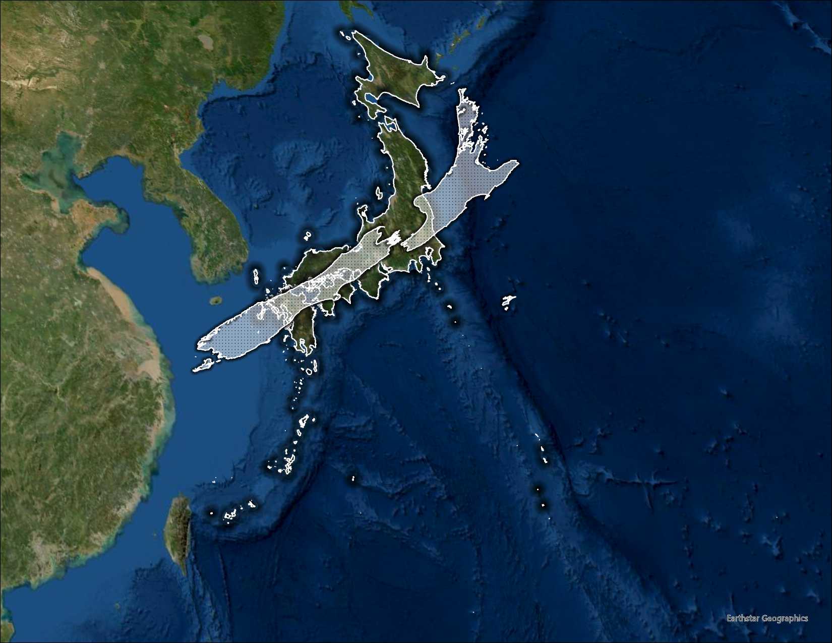
The base country should be the larger country that will be layered over some ariel imagery, and the Comparison Country will be a hollow polygon.
For my example, I compared Japan (base country) to New Zeland (comparison country).
Once added, Save your ArcGIS Pro Project.
Lets take a look at which projection we are working with. If you right click the country boundary layer, and scroll down to Properties, the should be a tab Source and then there should be an option in the details for Spatial Reference.
What is the Spatial Reference System of the data?
Additionally, ArcGIS sets the projection of the map itself too. We can have a different Spatial Reference system than the data that is in the map.
However, data added to the map will be projected-on-the-fly, that is, the data will visualized in the projection of the map without having to manually project the data into the same coordinate system.
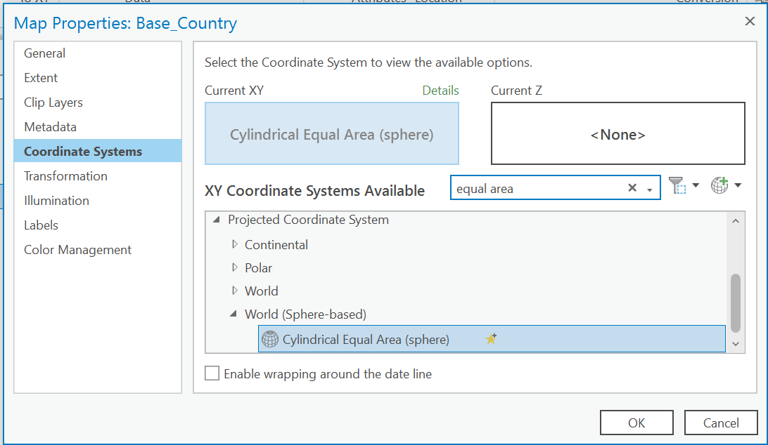
Lets identify the Coordinate System used in the map. Right click the Map item in the Contents Pane, and click Properties. Here, there should be an option for Coordinate System. What is the current coordinate system?
Since we are not doing any analysis for this project, we can rely on the projection-on-be the-fly to project our data.
As such, for us to be able to compare geometries, we need two things to be identical across our maps:
- projection
- extent
Lets get started.
Lets set a custom projection for each map window.
Go back to the Coordinate System Details pane that we went to before in the Contents of each map pane.
This time, we are going to change the projection to an Equal Area Projection. However, we are going to go a step further, and we are going to use a Custom Equal Area Projection with the Central Meridian set on the geographic center of our country.
We are going to use the “Cylindircal Equal Area (sphere)” projection. Type “equal area” in the search bar, and then click on the “World (Sphere-based) option under the Projected Coordinate System.
Right click Cylindircal Equal Area (sphere), and select Copy and Modify. This should open then window “Modify Projected Coordinate System”. Save your project
What are the details of this projection? What are the units?
We now can rename our custom projection BaseMap_CoordinateSystem or ComparisonMap_CoordinateSystem.
Google the geographic center of the countries that you are using for this project use the longitude. Convert this to Decimal Degrees if it is not already, and enter this into the Centeral Meridian box.
For example. For Japan, the geogrpahic center based on what I googled was 36°29’26”N 139°0’29”E. Converting the longitude, I got 138.008056. Make special note of the of the quadrant that the latitude is in, because you may need to make it negative.
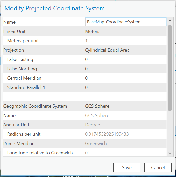
Click Save, and your map should update to your new custom projection system. Repeat this process for the Comparison_Country Map Tab. Save your Project
Symbology
I have added a couple of saved styles inside of our project, so now lets stylize our layers to set apart our maps so we can compare the features.
Right click on the layer and go to the symbology item. This should open a pane on the right side of the ArcGIS Pro window.
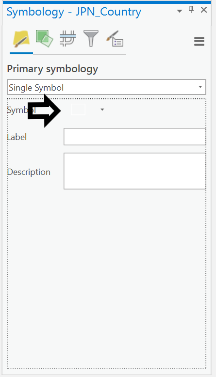
Under the primary symbol, there should be a box icon, and you should click on this item and get to the Format Polygon Symbology. There should be two options under favorites. Choose the appropriate symbology for the map.
If you want, you can mess with the symbology if you want, but I provided these layers so that you don’t have to fuss with what looks good without knowing how to deal with colors, hues, transparencies, etc.
Save your project.
At this point we should have our two maps set up correctly.
Base_Country
- Layers
- Country of your choice -> Styled with BaseCountry Outline
- World Imagery
Comparison_Country
- Layers
- Country of your choice -> Styled with ComparisonCountry stipling
Layout
At this point we are going to use our layout tab Area Comparison.
A layout lets us put different types of elements to style a map for printing. This is where we are going to apply our map hack.
Becasue we have two different maps, we are going to layer two map layers, and combine them as if they were one image on top of the other.
Comparison Map over Base Country.
Now, we need to make sure that the scale of our maps is identical. Since the projections are the same, if the scales are the same, we can be sure that a pixel unit is equivalent in both of our maps.
Open the Layout Tab. There should be two different layers representing our two our two different maps. For each layer, we are going to right click and activate the map frame. This allows us to interact with the map as if we were using it in the map tab.
Lets start with our Base_Country again.
Use the Explore tool in the Navigate Section of the Map Tab in the Ribbon to center your country in the middle of the map frame. Once you like the position of your country, notice the scale of the map on the bottom left of the Map Window. We are going to copy this extent and use it in our Comparison Map. Lets go back to the Layout Tab by clicking the Layout:BottomLayer at the top of the map window.
Activate your Comparison Map Frame (TopLayer). We are going to repeat these steps, but this time, we are going to paste the extent from our BaseCountry Map.
Make sure your countries are aligned in a way that shows off the shape and area of the countries you chose to compare. Save your map.
You’re Done!!!
Great job making your first map.
Lets export and image of your countries and share it in a discussion on Canvas for everyone else to see.
Go to the Share Tab in the Ribbon. In the Output section in the Ribbon, click Export Layout.
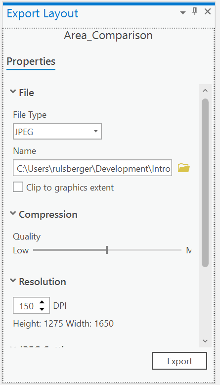
Export the map as a JPEG, to your project directory, with 50% Quality and 150 DPI. Click Export and upload this image to the discussion board with a title as Your Base Country vs. Your Comparison Country.
Save your project! You’ve finished.
Credit to John Nelson for this assignment/tutorial.