Project Summary
For our next couple weeks of work, we are going to be exploring relationships between different datasets and the Residential Security Maps created by the Home Owners Land Corporation (HOLC). These security grades were used by lenders to vet applicants trying to buy, or refinance their homes. Most often factors influencing the grade of the neighborhood included presence of persons of color, affluence of neighbors, and also other environmental characteristics. This action was called Redlining.
One of the consequences of these neighborhoods was the less access to wealth. Redlining stopped the investment into infrastructure into neighborhoods, and as such, deteriorated builds, outdated building materials. As such, we can hypothesis that redlining caused home values to not appreciate as much as other neighborhoods.
So let’s see what our data says!
Obviously, the best way to think about this question is by looking at the change in assessed values over time. However, for data and simplicity of this analysis, let’s see if there are still any relationship between current assessed values for single family houses and historic redlines neighborhoods.
For this assignment and the labs after, you will submit a Lab Write up with questions that are referenced in bold throughout these instructions. Include any screenshots and answers and upload to Canvas via the assignment.
Setup your Project
Let’s set up our project.
Create a new Lab folder. Create a raw data folder, and connect it to our ArcGIS Pro project.
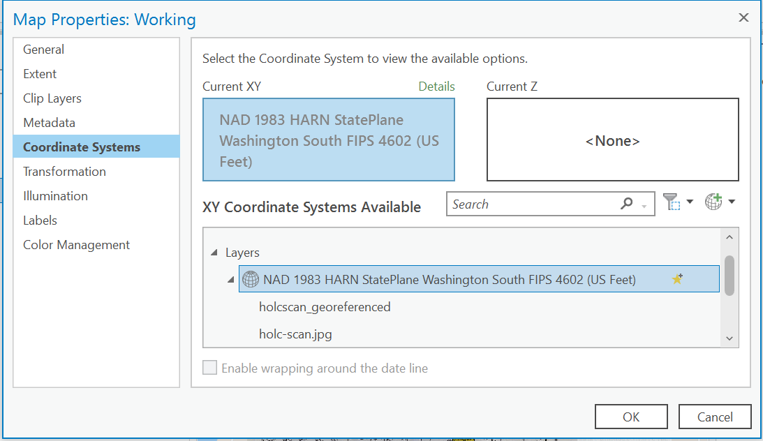
Add a new Map View, and this time we are going to set the projection of the map first.
Right-click on your Map Object, and go the Properties of the map. Change the projection to our favorite Washington State Plane South Projected Coordinate System.
Download the jpg image to our raw project folder.
Let’s start by digitizing the HOLC Neighborhoods.
Add the jpg image to our map. Use the Map Tab of the Ribbon, and click Add Data and select the holc-scan.jpg file.
We add the JPG, it will ask to run statistics on the data, click ok.
The file will be added to the contents of our map frame, but it won’t show up in the actual map. Any guesses of why this is?
Georeferencing
This image was from 1937. Our goal is to stretch and align this image so that it represents real space on our map. Then we can trace the data from the map to create a new dataset we can use in our analysis. This process is called georeferencing.
There isn’t any GIS data stored with an image file, it’s just as if you scanned a paper document, or took a picture from your phone.
To fit our image to our map, we are going to use known points on the map and associate them with real data points in our map document. What are some geographic points that are easy to reference? Keep in mind, we need to find points that are identical from 1937 to the present day.
ArcGIS has great documentation for Georeferencing if you would like additional reading.
Now to start georeferencing.
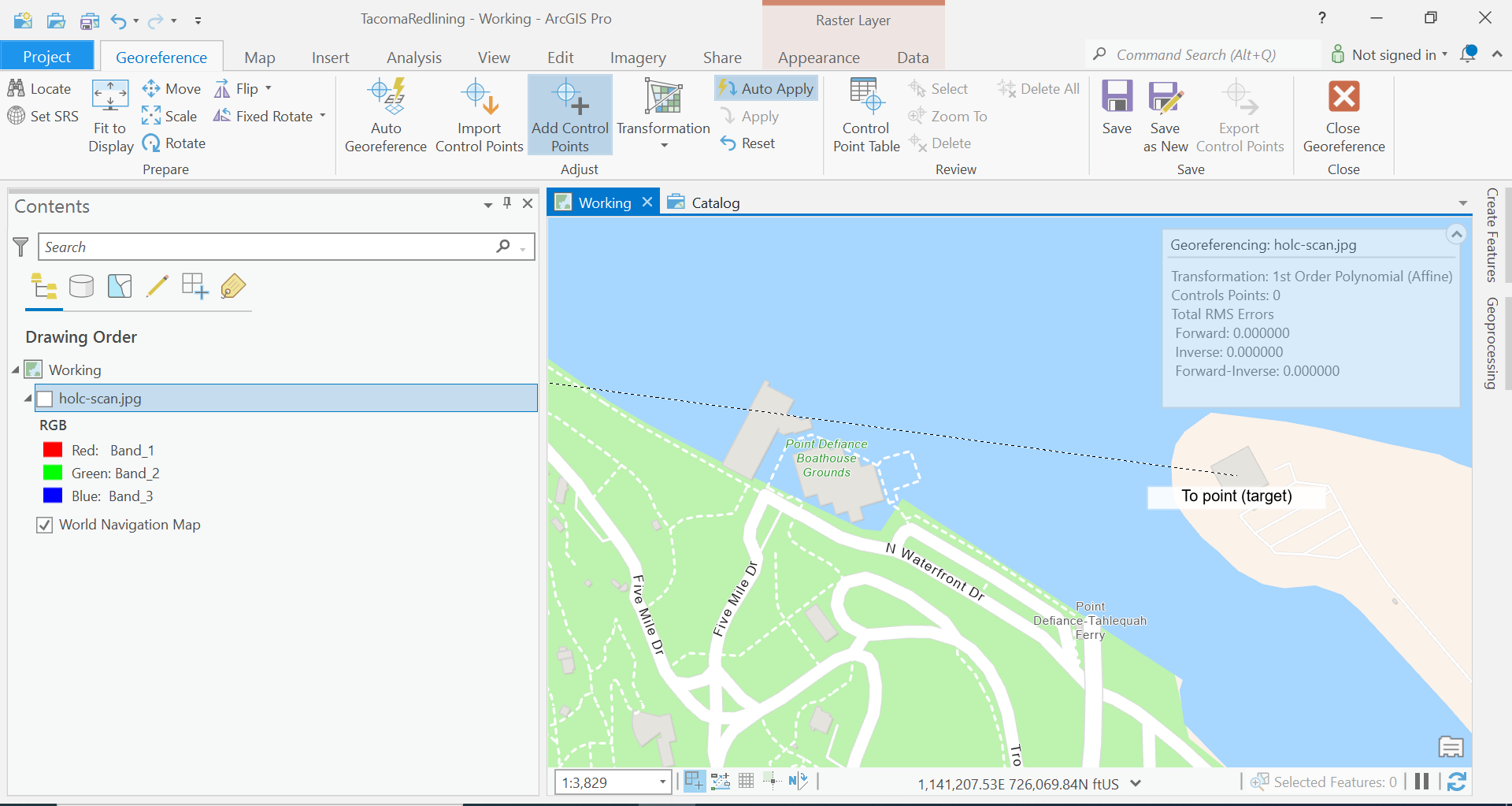
Click on the holc-scan.jpg file in your contents window, and select the Imagery Tab from the Ribbon. Click the Georeference button.
This will open a new Ribbon.
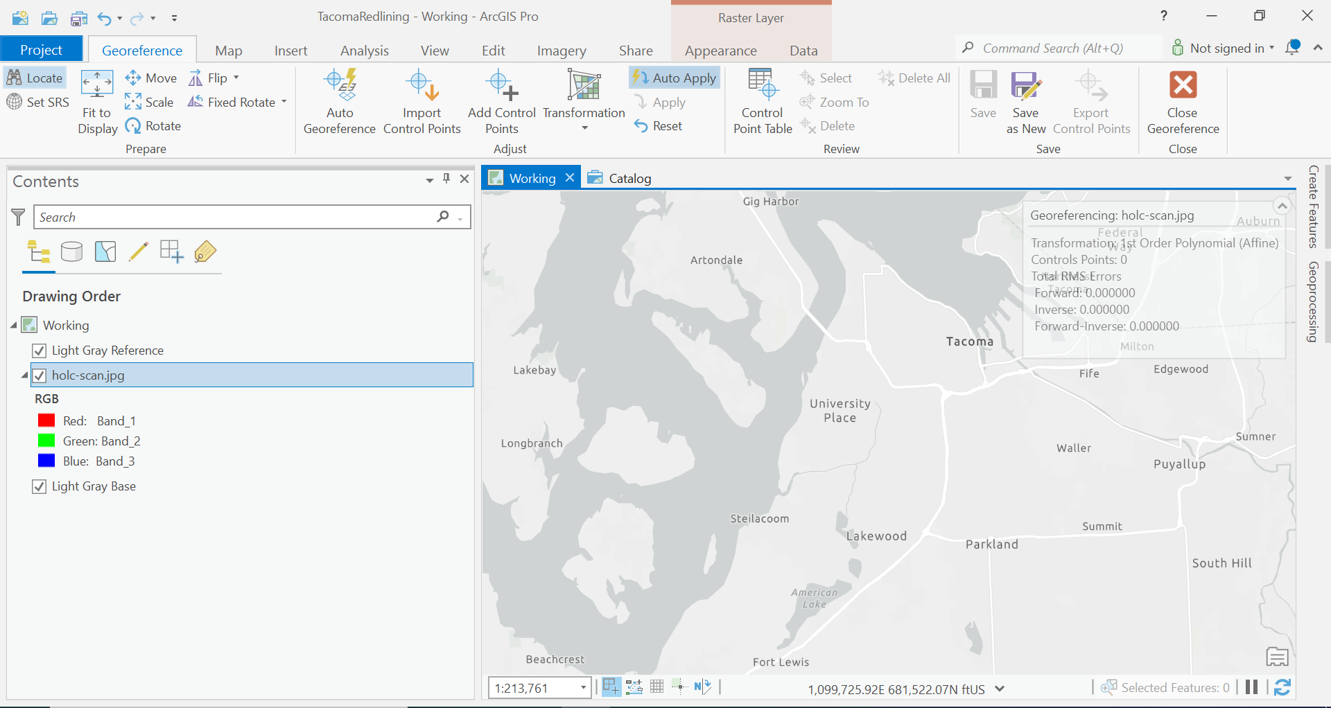
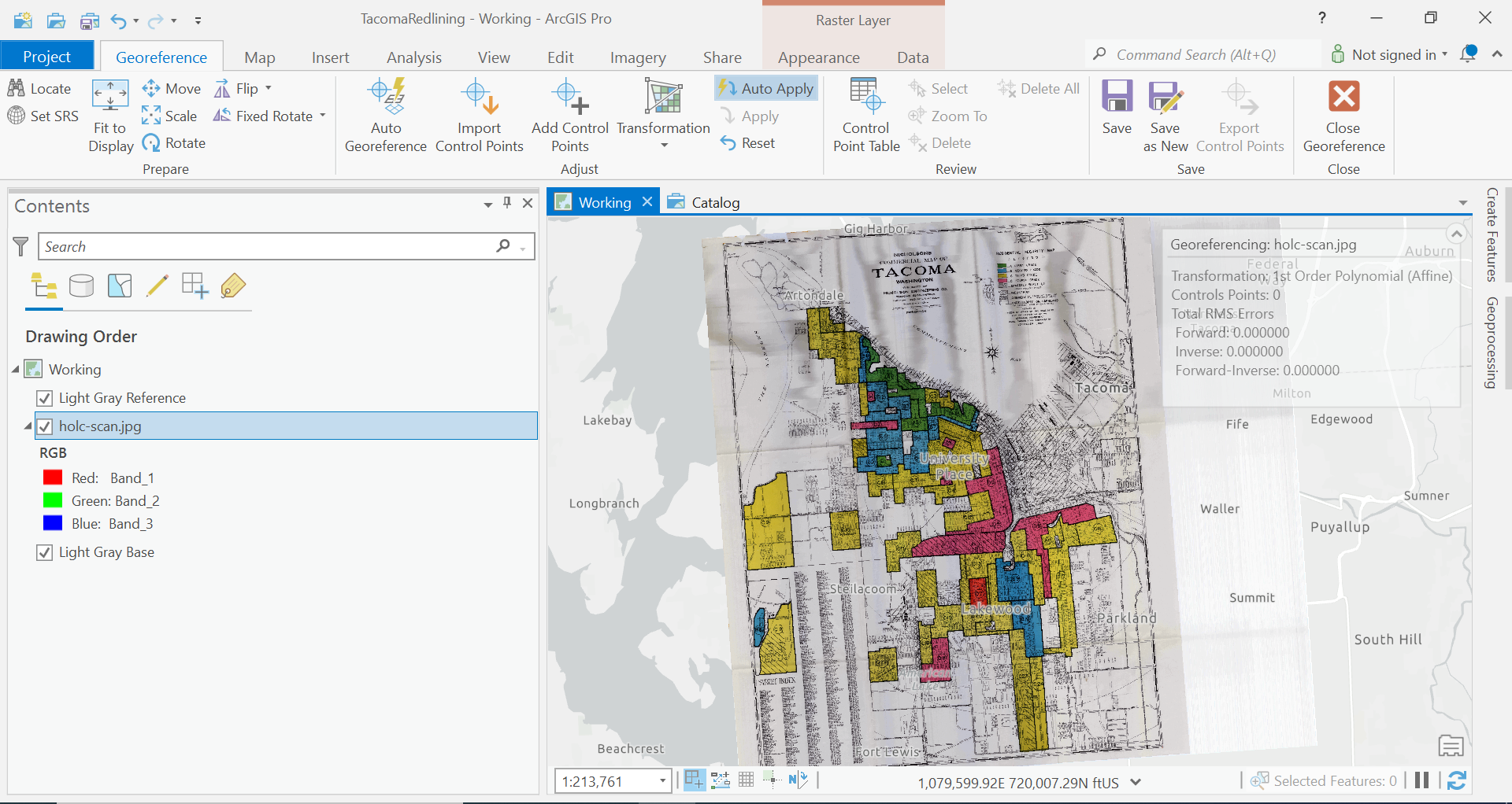
Our first step is Let’s try to get our map to fit to the area that we think it should be. So zoom to the extent that looks like it would be the same in our map to our jpg image.
Then click Fit to Display in the Georeferencing Ribbon.
So how well does your fit?
We know are going to find those reference points from our image and select where there actually are in our map.
We need to have a good selection of points all throughout our map to get an accurate portrayal. Say maybe 6-8 points in different areas.
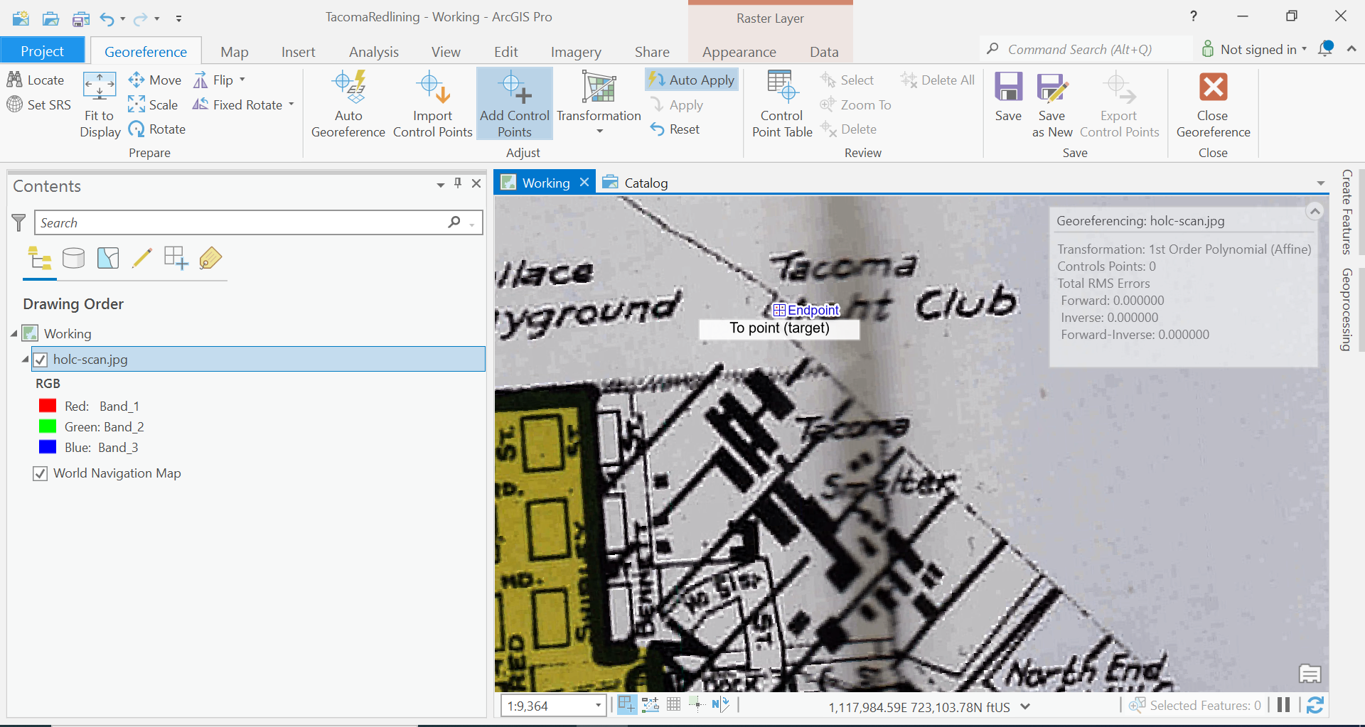
I think I am going to start with the Tacoma Yacht Club, the Southern Edge of Wapato Lake, the intersection of Pac Ave and 96th. Then we can see where distortion might be happening, before we add more points.
Let’s add these three control points. In the Georeferencing Ribbon, click add control points. We are going to click where the point is in our scanned image, turn off the layer, and click the location of the feature in our basemap.
Starting with the Tacoma Yacht Club.
The auto apply method will now translate your jpg image so that those points align. Let’s repeat this process for our next control point.
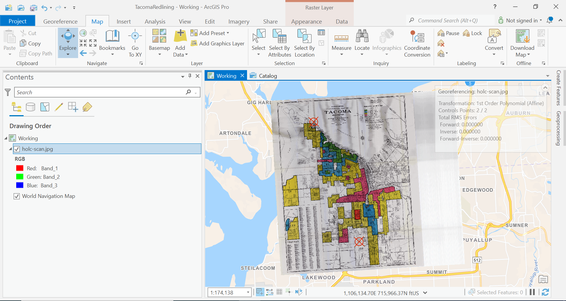
Ok, now we are getting closer. Let’s do our final point.
So we are close now, but let’s try a little bit more, my map looks like it could use a bit more stretching in the east and west directions.
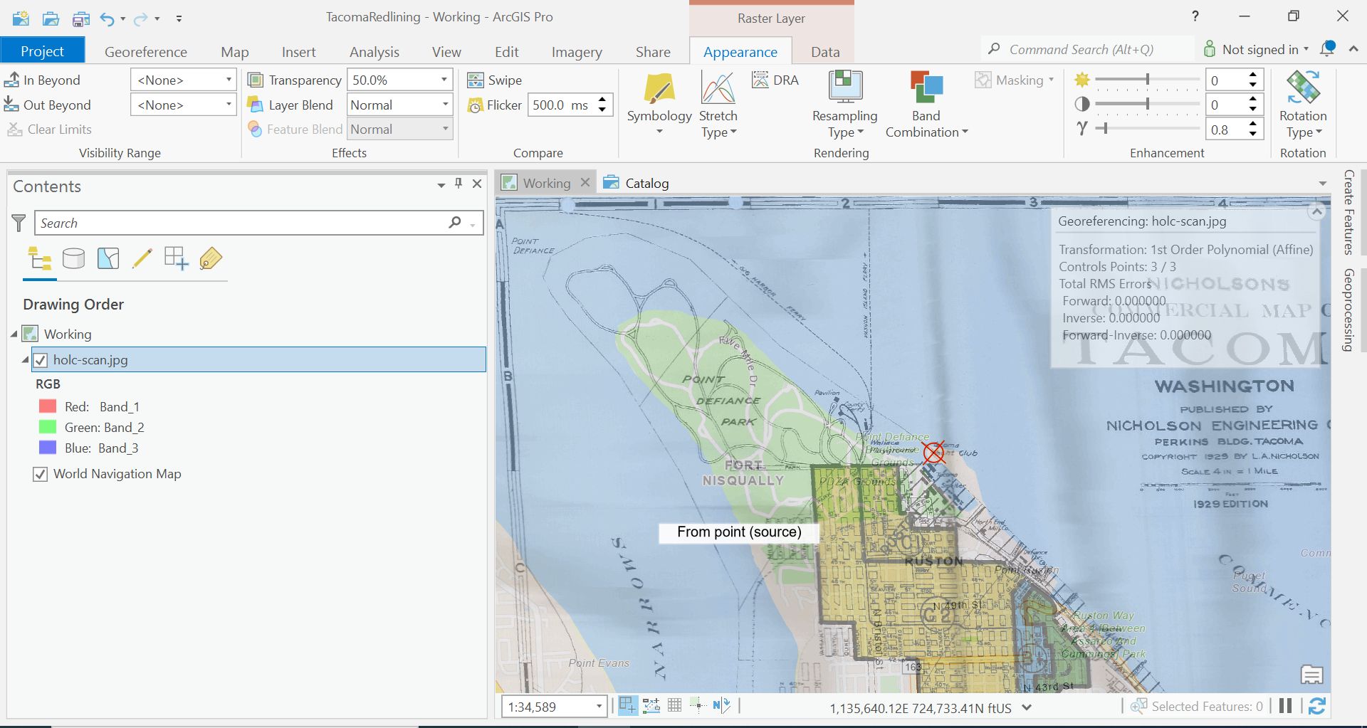
Let’s add some transparency to our image, so we can see our base layers data underneath our image.
Click on the Appearance tab in the Ribbon. In the Effects section change the transparency to something like 50%, whatever works for you.
Now looking at the North End of Point Defiance, we can see we aren’t quite there.
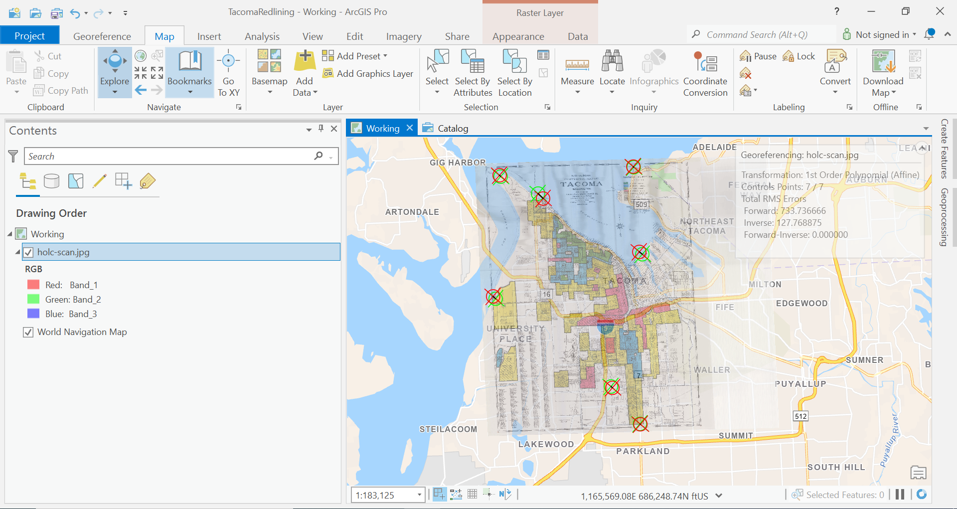
Move around the map now and find an several more control points until that you feel that the image aligns with our basemap well.
Here is my map after adding 7 control points.
Let’s save our work now.
Let’s save our file. Click Save as New in our Georeference Ribbon and save the file into our ArGIS Project Geodatabase.
Output Raster Dataset: Your GDB Location + Your file name
Coordinate System: NAD_1983_HARN_StatePlane_Washington_South_FIPS_4602_Feet
Geographic Transformations: None
Clipping: None
Cell Size: Keep Defaults
No Data Values: Blank
Output Format: Should be grayed out
Compression Type: None
Compression Quality: Should be grayed out
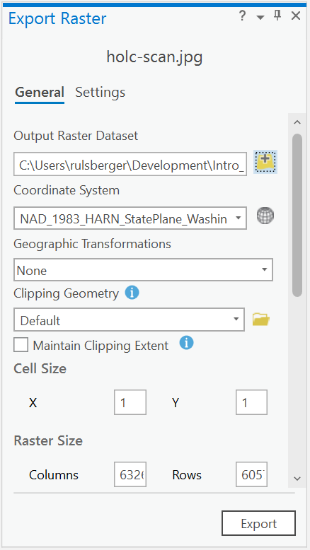
And also, let’s export our control points too in case something goes wrong, and we need to repeat this process. Click Export Control Points. These get saved as a text file, so Let’s save them in our raw folder.
Open the Raw Text File and copy this information into your Lab Write up.
Digitizing
Cool, we can actually see where our data is.
Now let’s create a new feature class in our geodatabase in which we will trace the features from the map to make our own copy of the data. The process of tracing data and creating a new version of data is called “Digitizing”.
Let’s first create a new Feature Dataset. Since we digitized our data in State Plane Coordinates, we want to make sure our data is consistent for the rest of our analysis.
Right-click on your eogdatabase, click New -> Feature Dataset. Create a Feature Dataset named HolcNeighborhoods.
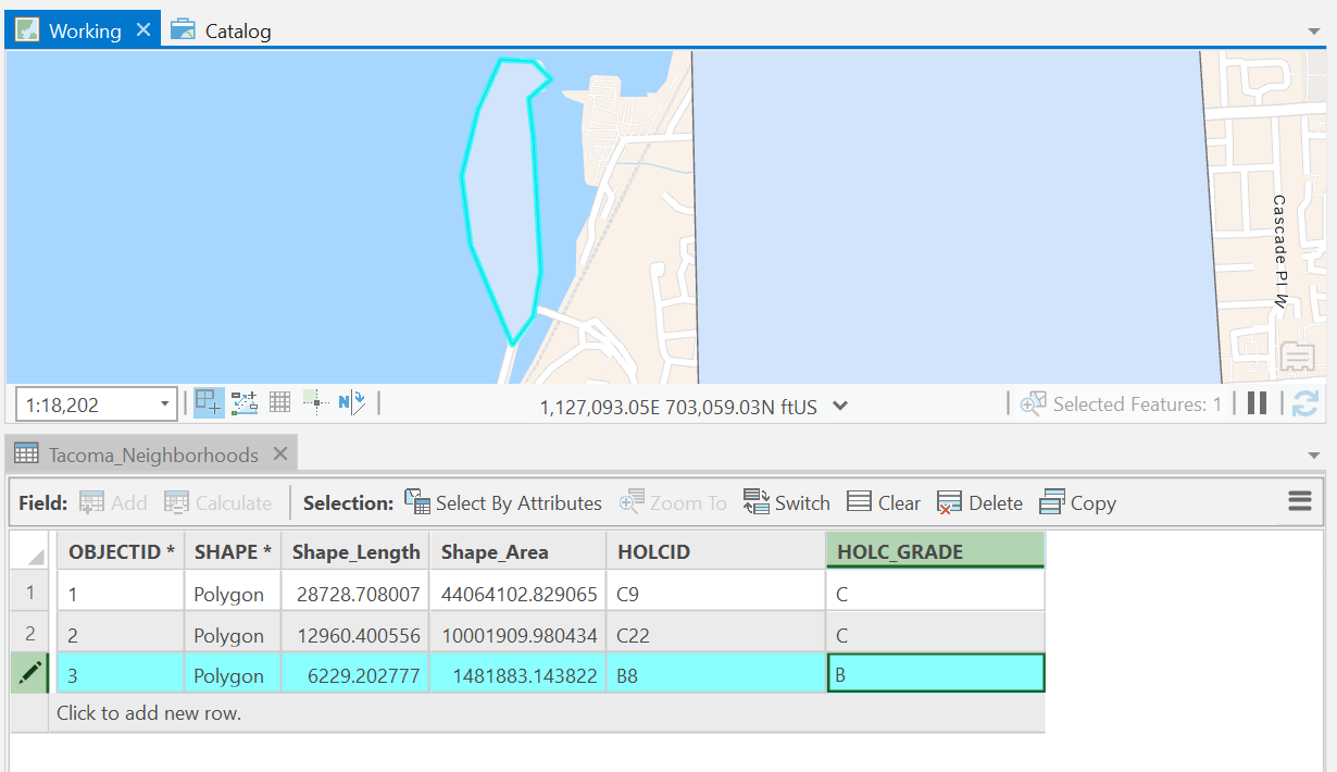
Now create a new Feature Class in the Feature Dataset with a polygon type called Tacoma_Neighborhoods. For our fields, we want to capture all the data that is in our map.
In this case, we have the following:
| File Name | File Type |
|---|---|
| holc_id | Text |
| holc_grade | Text |
Once you have created the file, it should be added to your map view.
Now, open the attribute table of Tacoma_Neighborhoods.
We are going to trace the polygons on the map, and input all the data associated with each polygon.
Select the Tacoma_Neighborhoods, in the contents pane, and click on the Edit tab in the Ribbon. Click Create and start tracing all the polygons on the map. For each polygon, make sure to enter the data for the feature you are tracing, namely, the holc_id and the hold_grade.
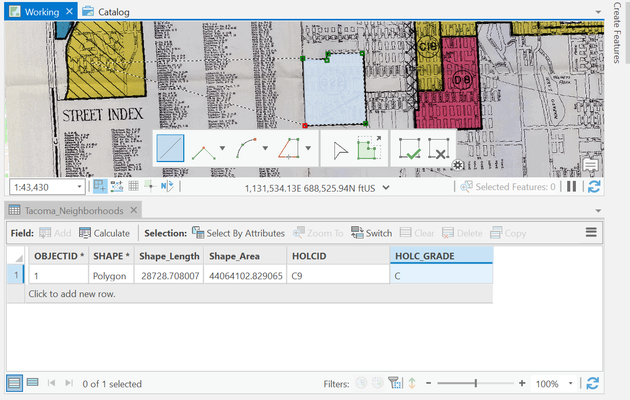
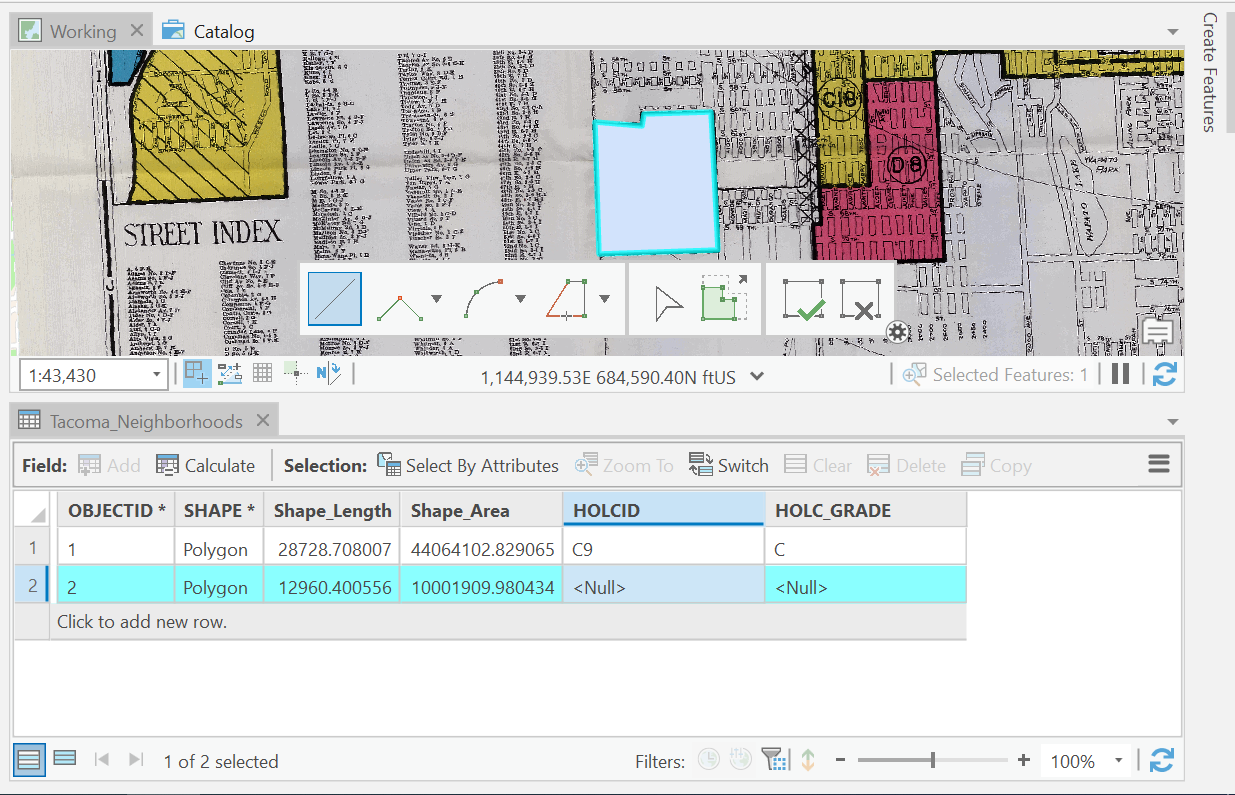
Remember to save often during this process!!!
One feature to note is that there is an inset map representing the features from Day Island off of University Place.
To be able to trace this feature, we would have to cut out this little inset map and georeference this little inset map since it’s a different extent than the rest of the map; however, to save time for this project, just digitize the feature from the basemap, and give it the right data.
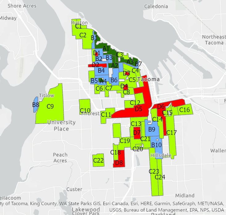
Great job guys, once you are done, let’s symbolize our map by holc_grade and we should have replicated the original map from HOLC.
Create a new map from your catalog and name it as HOLC Digitizing Exrcise. This allows us to save a style of a map outside a working version of our analysis, so we don’t have to worry about messing any symbology work that we may do for a map.
Go to your Catalog View and open the Maps Folder. Right-click here and add a New Map. Rename this map to HOLC_Neighborhoods_Digitized. Open this new map window.
Add your version of the Tacoma Neighborhoods. Try to choose the same colors for the grade, label the features based on their holc_id.
Take a screenshot of your Digitized HOLC Neighborhoods layer symbolized correctly and labeled and put it into a Word document for me to see all your beautiful work.
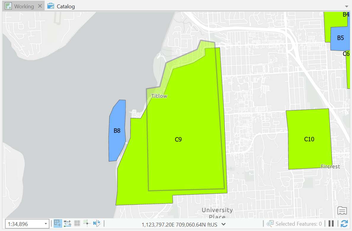
Just for kicks, Let’s download the real data from the Mapping Inequality Website.
Add this to your map and see how close you were to getting the polygons correct.
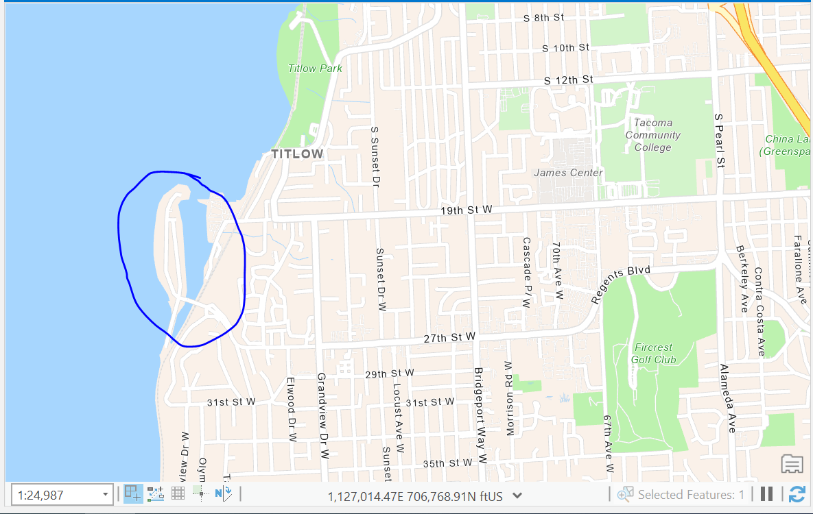
Take a screenshot of a particular area where you maybe could have done better, and add this to your lab write up. Write a short explanation of how you think you could have gotten better results from your polygon.
Assessed Values
Great job creating that data guys, we are going to use the original data from the Mapping Inequality Website from now on so let’s make sure to save a working copy of the data to our own geodatabase. This will make sure that each of you are not getting different results when we start working on our spatial analysis.
Our next steps are to find the average assessed value for each neighborhood in a normalized unit. For us, that will be assessed value per square foot of building.
Assessor Data
Let’s go get our data.
- Download data from Pierce County GIS Portal
- Download data from Pierce County Assessor page
- Download cleaned data from Ryan’s GitHub
Now let’s try getting to our housing details. In our case, the assessor tracks the value of homes to be able to collect the correct amount of property tax for the county. And as part of that practice, they appraise the condition and details of housing structures. These details are important for us in this analysis because talking about raw values of homes isn’t helpful. House values can be derived from several factors including size, location, and more.
Additionally, we know that there are some correlations that we could take as facts. We know that more affordable homes are typically smaller, and based on the historic practice of Redlining, we could assume that larger houses were built in places with higher grades.
So if we just look at raw housing prices, we potentially could just see the spatial distribution of home sizes vs actual house value. As such, we want to normalize this data to a unit that makes senses across all neighborhoods. For example, assessed value per Sq.Ft. This potentially should get us to the question of how much a house is valued in one location vs another.
Unfortunately, Assessor Data is typically not stored in GIS formats easy for us to use, but data is shared pretty regularly.
Pierce County Assessor Data Downloads
We can see that there is a lot of data here, but what is it? Thankfully, some metadata is typically shared which describes the data. In this case, Pierce County has provided two useful items:
- A table description at the left of the table download
- A table relationship diagram
Both of these will help us know what we need to download to answer our questions and how these tables are related to each other.
Take a look at these. Which tables (data) would we need to be able to get the total assessed value? Additionally, these files are raw data. What is this data type?
Ends up that these are Tab Delimited Data files, still stored in a CSV (Comma Separated Values) file. This requires some work on our end to get it useable.
Download the Improvement and the Improvement Built-As tables and data descriptions.
We work with this data, we need to open a blank excel workbook and import this data. Even when you do open it, you will see that the data is missing the headers for each of the columns. So, we need to import the data, pick the correct data types for each column based on the what’s in the descriptions file, add a row for the headers of each of the columns.
Whew…
Thankfully, for this lab, I will just take care of that for you. So download the zipped_assessor_data file from GitHub.
Additionally, we are going to need some GIS Data to talk about where these building are. For built environments, that data is stored in units called parcels. They are maintained separately from the assessor, so let’s grab that data.
Let’s import all of this data into our own geodatabase before we get started.
Now that we got our data, let’s get started.
We will be completing a series of data prep to be able to aggregate data to the unit, that is the HOLC Neighborhood. That will consist of the following:
- Select parcels that were part of a neighborhood in the HOLC Maps
- Get the building information for each parcel.
- Filter the parcels to only those parcels which are used for Single Family Housing.
- Assign our parcels to a HOLC Neighborhood.
- Aggregate the data and calculate statistics based on the HOLC Neighborhood and HOLC Grade
- Map it!
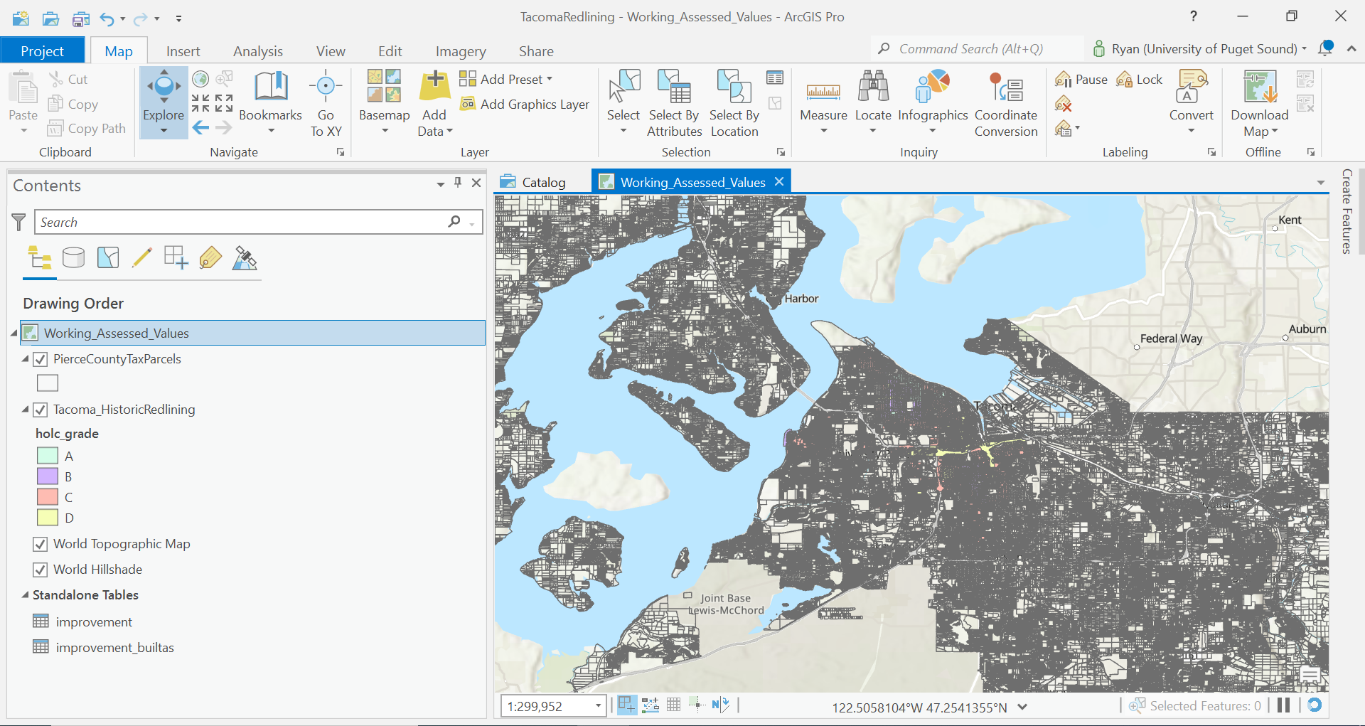
Let’s remove all our digitizing work from our working map file, until we have our new data and the HOLC neighborhoods data from Mapping Inequality website.
Layers (From your own geodatabase):
- Pierce County Parcels
- HOLC Neighborhoods Data
- Table: Improvements
- Table: Improvements Built-As
- Select parcels that intersect with HOLC Neighborhoods data
One thing that often becomes helpful while doing analyses is to be able to work with smaller units of data. In this case, we have a lot of records to deal with in our parcel data set, and even more when thinking about the buildings that are residing on these parcels. Later we are going to have to classify some of this data so that we are assigning it to our own useful bin for us to track. Working with a smaller dataset can be helpful as it can eliminate values/work we need to do. But the caveat to this is that if we make a mistake, and say our geometries change, we may need to remember to classify data again based on new samples.
Either way, let’s go with the easier route for right now. Use the Select By Location tool in the Map Tab of the Ribbon. We want to select all the parcels in Pierce County that intersect with HOLC Neighborhoods.
Run this selection and Export a Copy of this selection to your geodatabase. Make sure you give the file a meaningful name because we are going to have a lot of copies of parcel data in this lab.
- Join Building Information to our Parcel Data
As we discussed earlier, we are wanting to get attributes of our data at the building level which don’t have any spatial information about them. So, we need to join our attribute information to our parcels.
First, we need to think about joining our Building Tables.
If we go back to the Pierce County Table Relationship Diagram, we see that there are actually two different keys we use to joining the tables between the Improvement and Improvement Built-As Tables:
- Parcel Number
- Building ID
A limitation that we are hitting is that ArcGIS join let us only relate tables based on a single field, so what can we do?
Let’s use the field calculator to create a field that is a combination of these two fields!
Calculate a new field in both the Improvement and Improvement Built-As Tables called Parcel_BuildingID.
And for the calculation of this field: !parcel_number_text! + '_' + str(!BuildingID!)
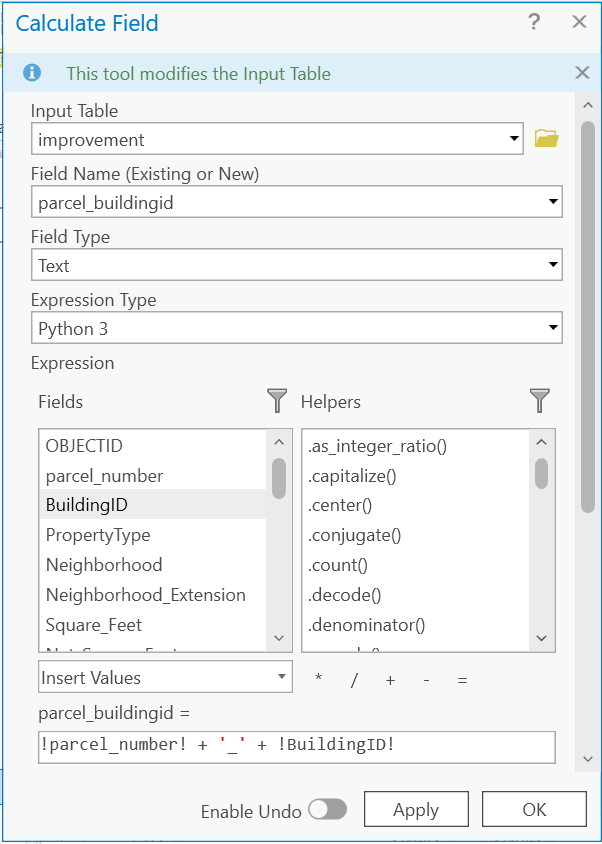
Once that is done, join the Improvement Built-As to the Improvement. Your joining field in this case is our new field Parcel_BuildingID.
Let’s export this data as a new table, and clean it up so that it only is showing the data that we want.
Right-click the Improvement Table, and export. Again this is derivative data, so give it a name that will make sense once you open it in say another 6 months.
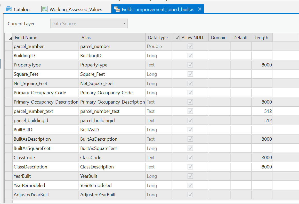
Once open, Let’s go ahead and remove any attributes that we don’t need. Open the attribute table, and Right-click on the fields that we do not need and click delete.
Keep the following fields:
Let’s join the new Improvement + Improvement Built-As table with all our building details to our Pierce County Parcel Dataset.
There were some interesting things with this dataset, especially when converting the data from the Tab Delimited Data to a CSV and then again into our Geodatabase. It ends up that the ParcelNumber is a field type TEXT but is actually a number value. For example, 1234567891. However, some parcels were identified with a leading zero in their parcel number (0123456789) and when ingested into Excel, it stripped the leading zero. In this case, the documentation tells us that a parcel number should be a 10-digit code. I took the liberty to clean this up for you, and add a leading zero to parcel_numbers where needed, but the code is added in the field parcel_number_text
So, all that to say, Join your Improvement + Improvement Built-As table where TaxParcelNumber = parcel_number_text
- Filter data to Single Family Buildings
Assessor data tracks all property information. But that also means that we have parcels that are used for commercial uses, multifamily uses, and more.
We particularly are interested in the ability of housing to generate wealth, so Let’s only look at the values of Single-Family parcels.
Use the Select By Attributes tool to filter the records on Primary Occupancy Type. We are looking for values that represent Single Family Households.
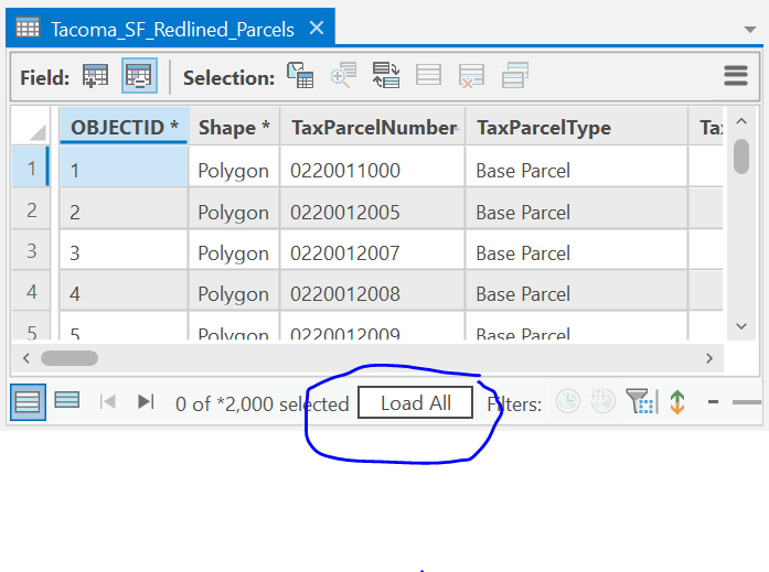
Run this Selection. And Export. Name something like Tacoma_SF_Redlined_Parcels.
Additionally, in Urban Planning, just because zoning restricts some uses in an area, often zoning laws change and non-conforming uses can be ‘grandfathered’ in. So Let’s also remove these additional uses
In Land Use Planning, these often include housing types which contain several units, but still Single Family Home like structures like Duplexes.
So Let’s make sure we are filtering out that data too.
For this filter, there are a lot of records for us to work with so Let’s work in chunks of data.
Let’s calculate a new field called SingleFamily_LandUse and Let’s bin the values of the LandUse_Description into a Boolean. Another way to think about this is we are going to look at each LandUseDescription Category, and determine if it meets the description of Single Family use or not.
So first, this time Let’s add our new field with type text. Let’s say our values can be Yes or No. Start by selecting the LandUses which appear to be Single Family like descriptions and run that selection. Now while that selection is set, use the Calculate fields to add the value 'No' for those specific records. Hint, there are other ways to calculate your conditional expression than field1 = value. Try using some other operators to make your life easier.
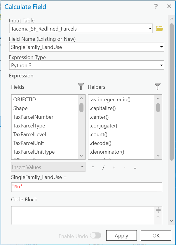
Do this until all values of LandUse_Description until all values are classified as 'Yes' or 'No' being
a Single Family Land Use.
Let’s run a definition query now to filter our data based on this new field, so we only show parcel and building records that are a Single Family Land Use.
In your lab write up answer how many records are not Single Family Land Use?
So before going any further, Let’s take a look at what other data is all here for us to look at.
Open the attribute table of our Single Family Parcels, and sort by the Tax Parcel Number. Scroll down until you find a duplicate value. What is the difference between the rows?
So because we are looking joined buildings to our parcel data, there are possibilities of multiple buildings being located on parcel.
We could spend some more time filtering these out until we try to get 1 building per 1 parcel, but there is not any guarantee we could actually do that. For example, Assessory Dwelling Units could exist on a parcel and those are two buildings which are livable space. Additionally, a detached garage is not livable and should likely be removed from the analysis.
One useful thing to do is to use statistics to display a histogram of data. This allows us to show the distribution or other statistics across a particular field.
First, make sure the table is showing all 46855 records.
Right-click on the Built-As Description field and click Statistics.
This will open a tool to create a chart based on this field. The statistic we are wanting to use is count.
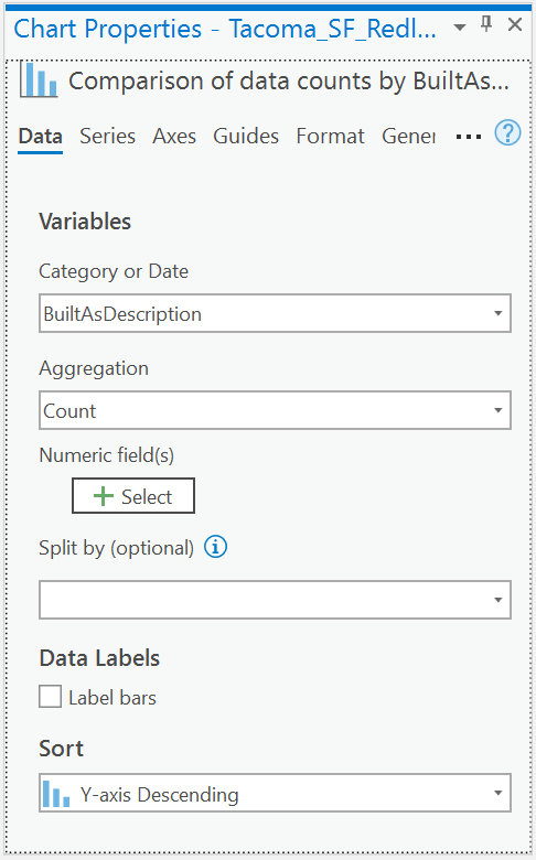 .
.
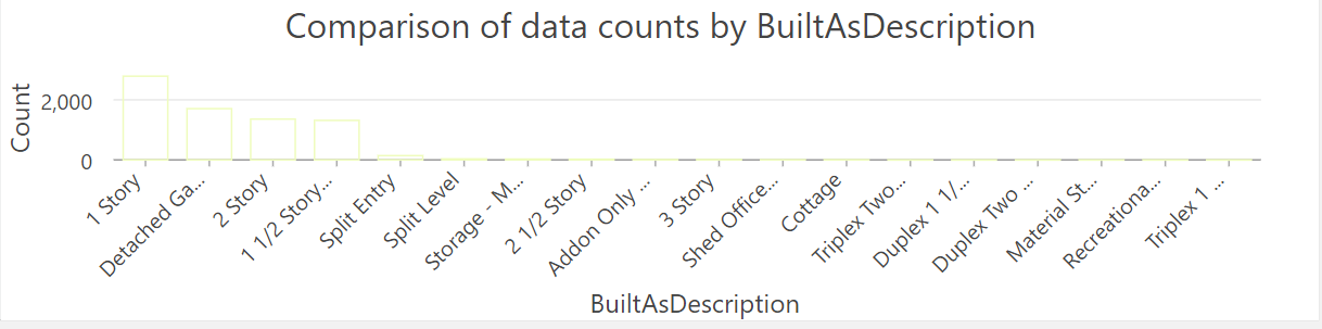
*Take a screenshot of this chart and add to lab write up. If you hover over the bars, it should give you details about that bar. How many records are there for Detached Garages. Hint, its the second bar.
So we aren’t going to remove these values, but the potentially could affect our total square footage. We just don’t know if the total square footage of the garage is included for housing which contains an attached garage. But now, we need to get to a point where we have 1 parcel record and the total square footage for all the buildings on that given parcel.
We get to use the Dissolve Tool.
This tool is going to aggregate our data based on its geometry. We can then calculate a set of given statistics, and we should only have 1 parcel for each record.
We are going to dissolve features, and calculate the following statistics.
Average Year Built -> the average year built for all buildings on the parcels Total Square Feet -> the sum of all buildings square footage First Taxable Value -> this data is stored at the parcel, so we don’t want any statistics on it. Just return the first record Count TaxParcelNumber -> the total number of occurrences of this parcel_number (read as the total number of buildings)
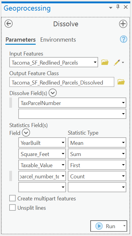
How many unique parcels are now in our dataset?
Finish this up by calculating a new field called Value_per_SQFT.
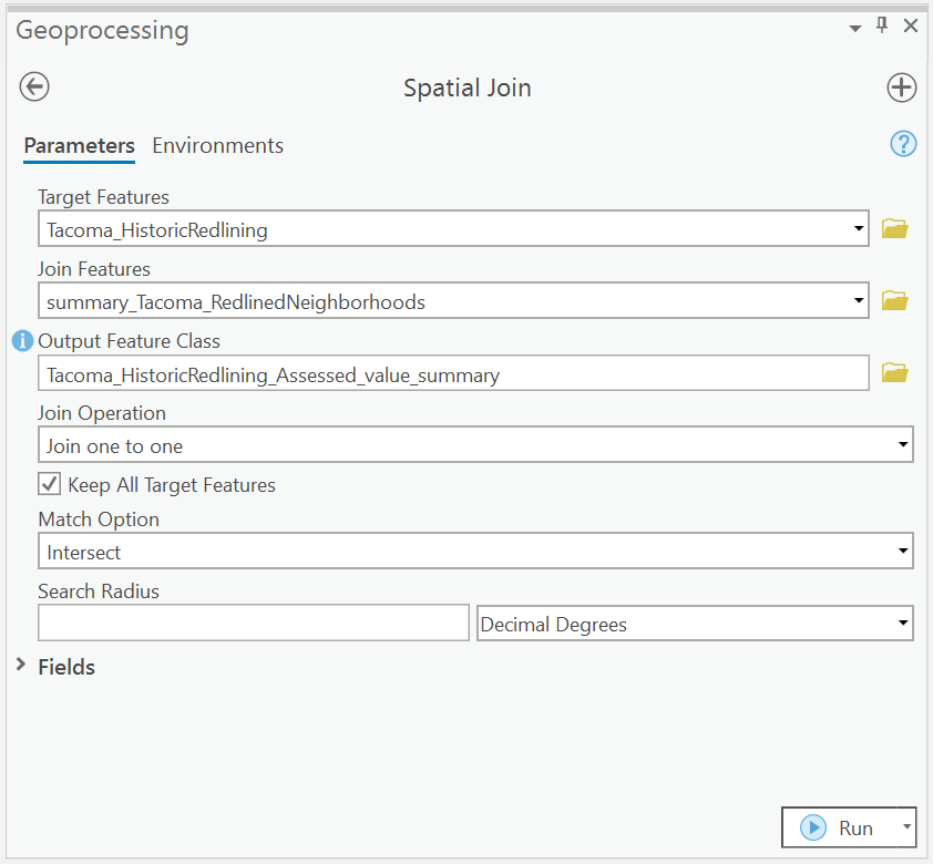
- Use the Spatial Join Tool to Join the Attributes of HOLC Neighborhoods to the Parcel Data.
We are now going to use our first spatial analysis tool, Spatial Join. This operation works similarly to the join tool, but in this case, there isn’t a primary or foreign key for us to join on. Rather, the join operation is performed using Spatial Operations.
Use the Geoprocessing Tab, search for Spatial Join. We are joining the neighborhoods’ data to our parcel information where they intersect.
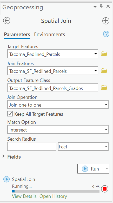
Once completed, you should have a new layer of all the neighborhoods in Tacoma, but with the attribute data from all the parcels added to it.
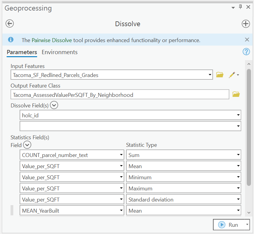
- Dissolve again. x2
Now it’s time for us to run the dissolve tool again.
By joining all the parcels, we can get some statistics for each of our neighborhoods. ’ We would like to be able to see the distribution of the data at two different levels.
- the individual neighborhood (holc_id)
- by the HOLC Grade (holc_grade)
So we are going to run our dissolve tool again dissolving by each of these fields.
Let’s name our data as such: Tacoma_AssessedValuePerSQFT_By_Neighborhood Tacoma_AssessedValuePerSQFT_By_HOLCGrade.
For both of the layers calculate the following statistics for both groups.
Total Buildings Average of Value per SQFT Min of Value per SQFT Max of Value per SQFT Standard Deviation of Value per SQFT Average Year Built
The result will be a layer representing all the parcel geometries that are part of Neighborhood
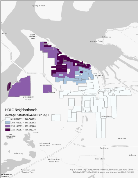
- Map it!!!
Let’s create two new maps based on these two datasets we worked with; give them an appropriate name and add both the raw mapping inequality data, and also our new summary data correctly for each map.
For the averaged assessed value per neighborhood map, join the data back to the original Tacoma Neighborhoods so we have the average assessed value per square foot for each neighborhood geometry.
For this map, we are going to bin our data into four categories using a distribution method called Natural Breaks (Jenks). This will automatically bin our data based on its distribution into 4 distinct categories. Choose a neat color ramp and click okay.
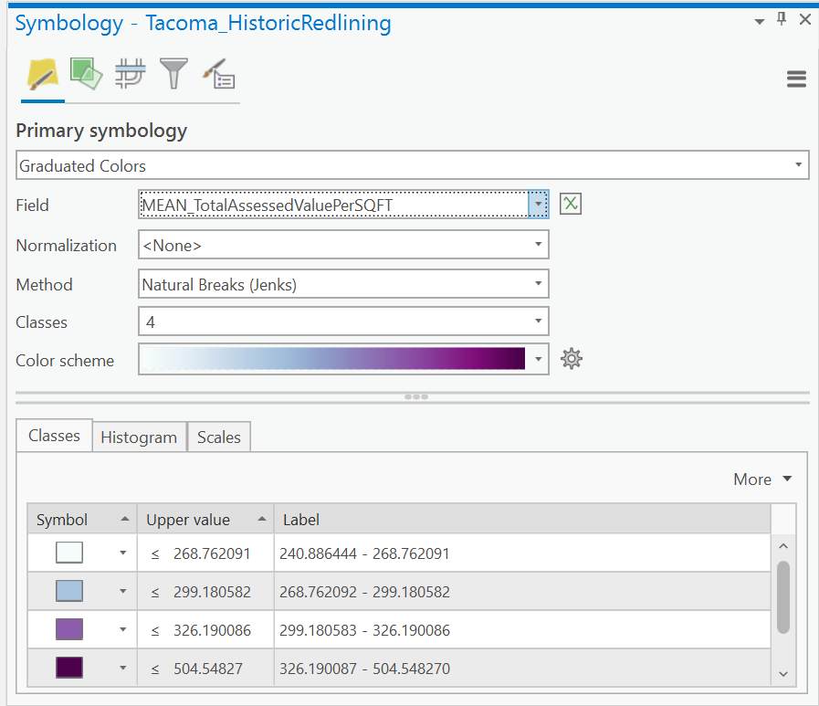
For each map, add a new layout, and add a legend showing the distribution of values for Assessed Value per SQFT.
Additionally, create a table for the statistics of total average assessed value per sqft per HOLC Grade based on the export from Tacoma_AssessedValuePerSQFT_By_HOLCGrade.
Something like this:
Average Assessed Value per SQFT
| Grade | Average | Min | Max | Standard |
|---|---|---|---|---|
| A | ||||
| B | ||||
| C | ||||
| D |
Lastly we are going to make one more map.
We would like to calculate the Z-Score of each neighborhood to see if the distribution of assessed values follows any general trend.
So Let’s go back to our raw parcel assessed value per square foot map.
Let’s dissolve this one more time, but this time, we would like to see that average values and standard deviation of all the single family housing in our neighborhoods.
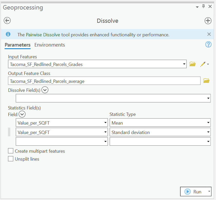 .
.
The result of this process should be a single row calculating the average and std. dev. of assessed value per sqft for all features in Tacoma.
Let’s create another map called z-score, and add both this data and our Tacoma_AssessedValuePerSQFT_By_Neighborhood to a map with the original map redlined data.
To add the attributes for our summary for all of Tacoma to our Neighborhoods, Let’s use a spatial join.
Clean up the table so that we only have the fields we need to calculate the z_score. That is:
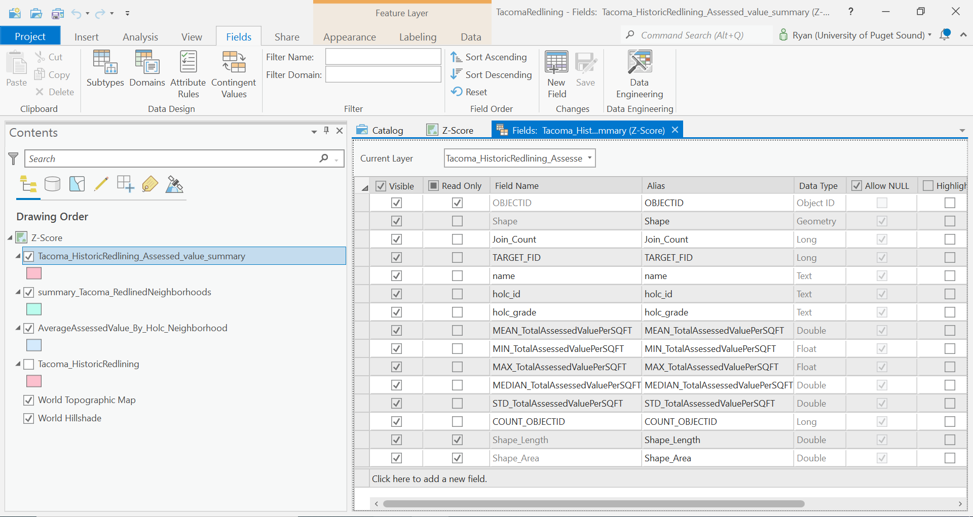
Rename the fields: MEAN_TotalAssessedValuePerSQFT -> avg_av STD_TotalAssessedValuePerSQFT -> std_dev_av
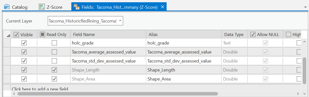
Join the Tacoma_AssessedValuePerSQFT_By_Neighborhood to this based on holc_id.
And finally, calculate the z-score for each of the HOLC_IDs.
(!neighborhood_avg_av! -!avg_av!)/!std_dev_av!
Let’s again symbolize by using a Graduated Color Map using Jenks Classification into 4 bins. Choose a color palette symbolize.
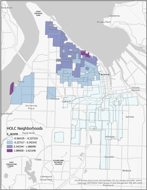
Create a Layout and a legend and export this map into your lab write up.
Compare the distribution of housing values to the original HOLC Grades map. Does the same spatial pattern exists? Is this what you expected? What other factors could be at play here