Overview
Our final installment of our HOLC Neighborhoods analysis is to identify if there is any correlation between HOLC Grades and Environmental Contamination.
Before Point Ruston Developments, the ASARCO Smelting Facility dominated the Tacoma Waterfront and operated from 1888 to 1985. If you want to read some more history, give it a read here.
Consequently, this industry operated at the same time that these maps were drawn and may have been the industry where the ‘working class’ actually worked here in Tacoma.
However, the Smelter was very bad and the fallout from the smelting processes caused contamination throughout Pierce, King, and Kitsap County.
We are going to use GIS to explore this dataset thoroughly.
Raster Data
In particular, we are going to use this lab to start identifying how to work with Raster Data. For data like our smelter plume, we often sample data at discrete locations, but the data is actually a continuous surface. In this case, we have pollution of Arsenic and Lead as fallout from a single point source. It has been deposited these contaminents in different degrees based on the prevailing wind currents in the Puget Sound Area for years, so if we viewed this data it would look like a contamination surface.
Project Setup
- Create your ArcGIS Project
- Create your raw folder, add as a connected file
- Create a New Feature Dataset in the Default Geodatabase so that we are always working in Washington StatePlane South
Download Data
Tacoma Smelter Plume Data
Download the data from the Environmental Information Management System from Washington State Department of Ecology.
We are getting data from the TSP Studies, and specificically for Pierce County. EIM Data Search TSP
First, let’s make sure we know what we are actually looking at. The paper resulting from this study, can be found here.
Write up a short paragraph study about what this study, and what are the data limitations for using this data to compare the contamination levels of pollutants to Tacoma HOLC Neighborhood grades?
Import these .csv files into your Geodatabase.
Mapping Inequality Data
Download the mapping inequality data again or import the data from your previous project. Mapping Inequality Data Download
Get you map setup how you want, maybe add and style your neighborhood data.
Soil Sample Locations
First, after looking at our data, it appears that EIM summarizes all the data we need into the Results csv file. So let’s just get to work.
First, we need to make our csv data a spatial data layer. Add the Results Table to our map, and display our Results based on the XY Locations. If you right click your results table, there is an option to Display XY.
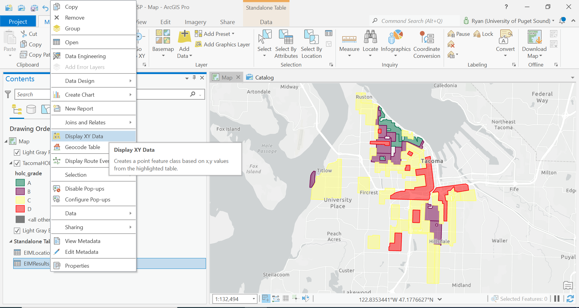
Now to be able to display our data correctly, we have to know what projection or what format our data is in. Run the Display XY tool with the correct parameters. Once those results are done, we would like to project our data again to the correct projection, so lets export/import it into our Feature Dataset which we created in Washington StatePlane.
The data downloaded from the TSP study contains a lot of information that various we can use in our understanding of our data. Not only does it contain two different contaminants, but also various sample depths too.
Summarizing our data, how many unique sample locations are there?
We need to break down these data into similar data.
Export the data to two different layers, one for Arsenic and one for Lead. Additionally, to keep track of this, let’s create two different maps for each analysis.
Export two layers to the Feature Dataset
- TSP_Arsenic_Results
- TSP_Lead_Results
Add each to its own respective map. To copy the neighborhood’s data, you can actually right- click on the layer to copy, and move to the second map. Click on the Map Title in the contents, and paste.
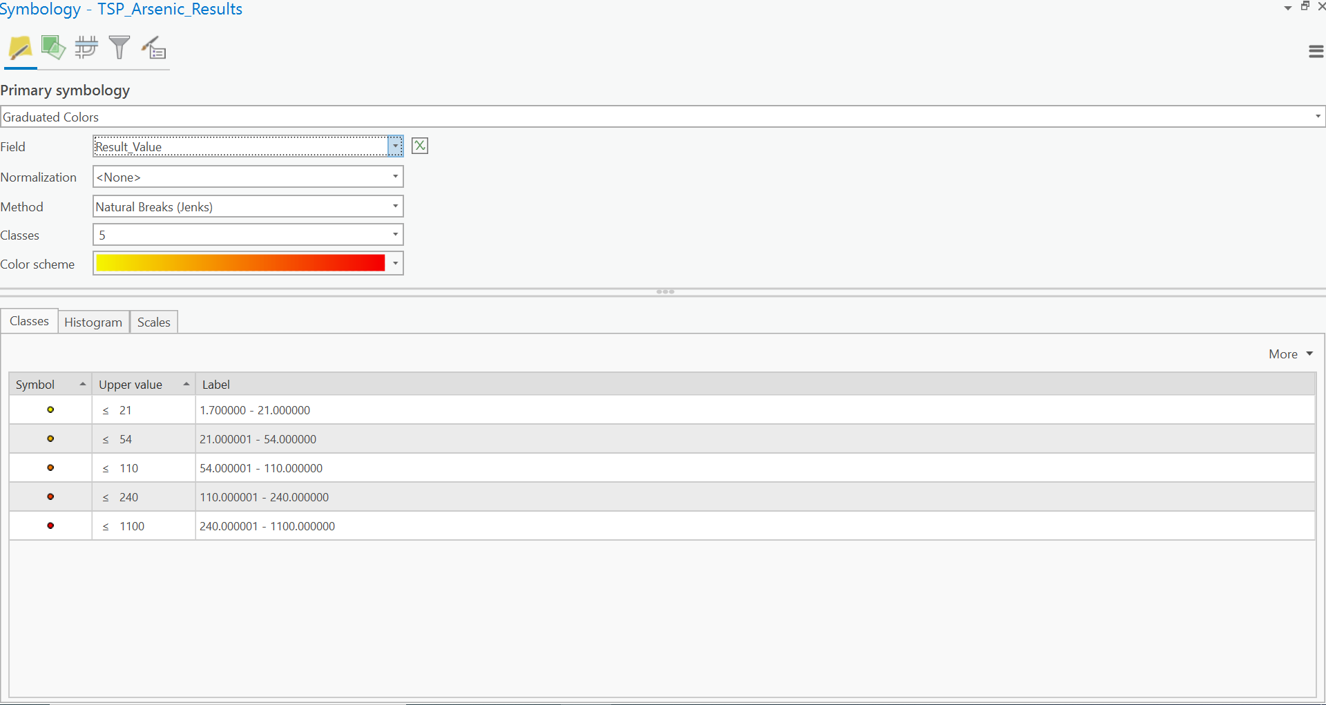
For each layer, display the contamination using a Graduated Symbol map using the standard 5 Classes of Jenks Natural Breaks. Post this into your write-up.
Inverse Distance Weighting (IDW)
As we discussed above, points do not give us a lot of information about how contaminates are spread throughout Tacoma. Rather, we would like a ‘contamination surface’. To do so, we will basically use statistics to estimate all the values between points. There are actually many ways of doing this but to explore Inverse Distance Weighting or IDW. Give the following description a read.
So let’s do it!
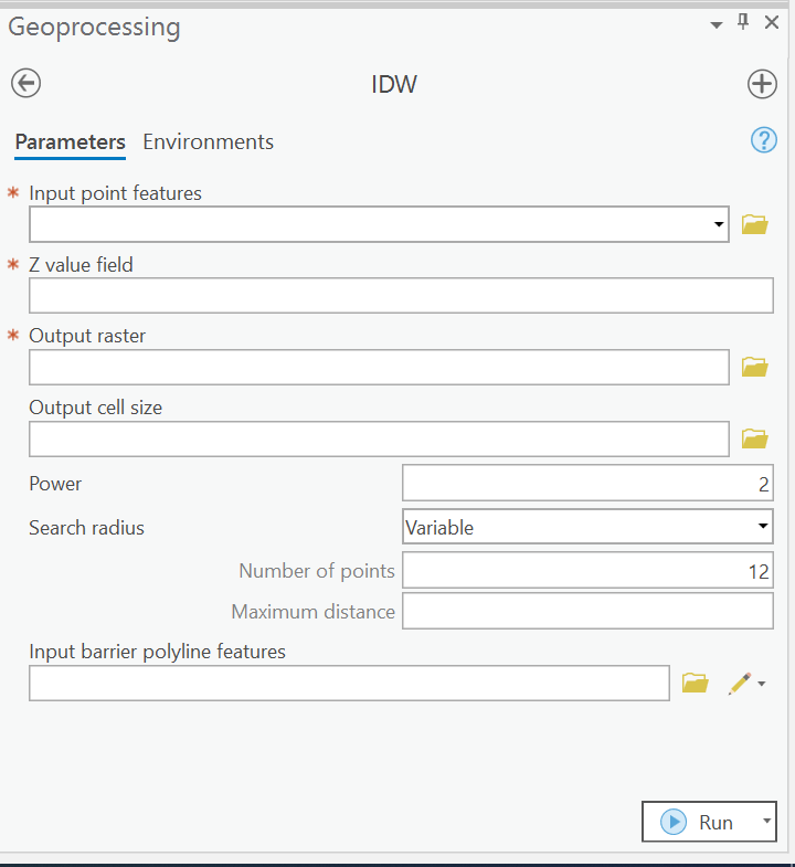
Open the Geoprocessing Tab and search for IDW (Spatial Analyst Tools).
 .
.
Give to tool description a read also by clicking  .
.
Now input the following paramaters:
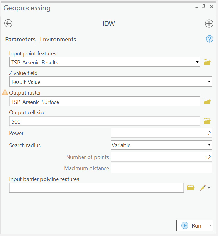
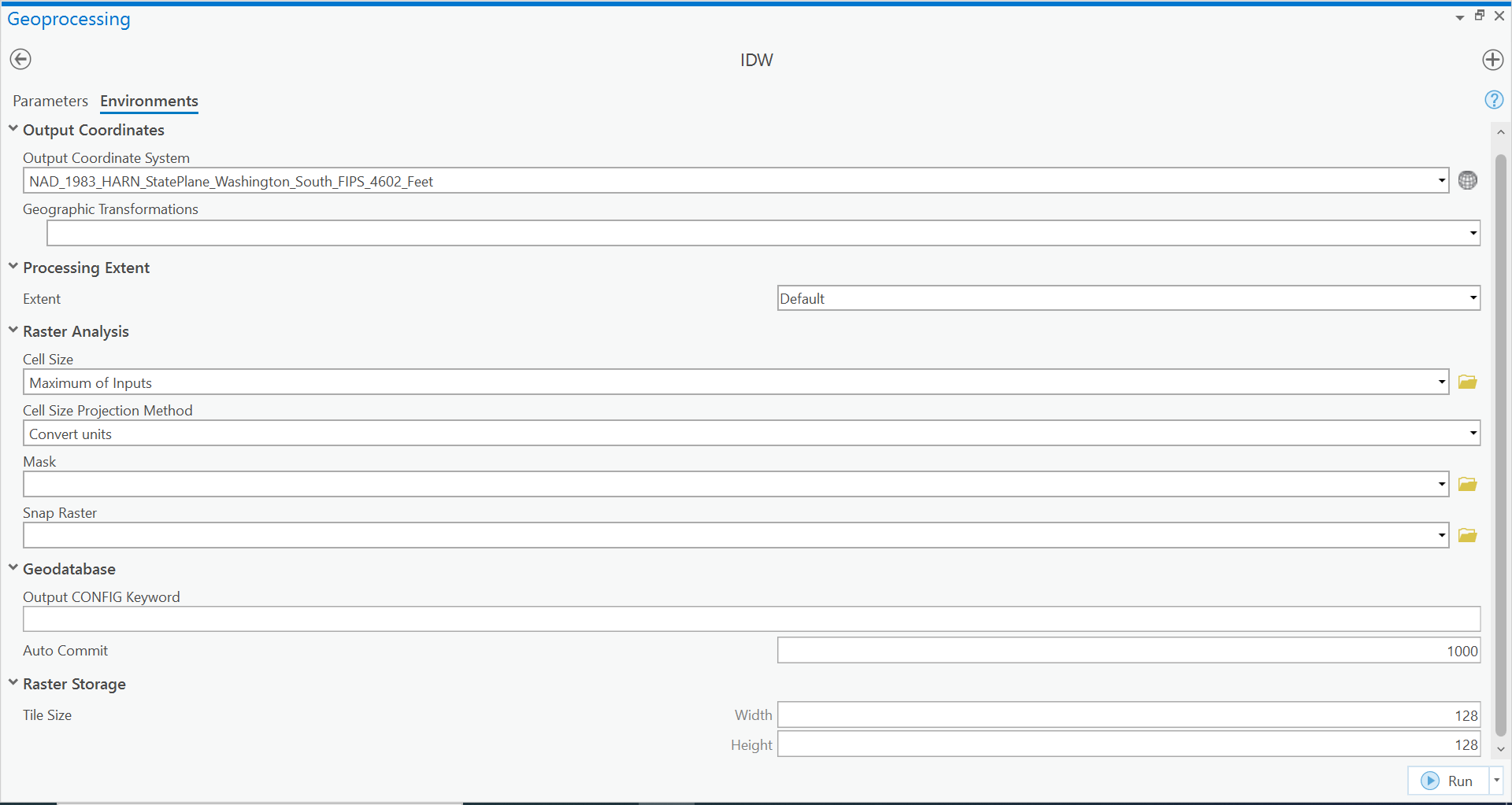
And before running we are going to edit the environments for running the tool. Environments are additional setting that are configured from the ArcGIS Project level and the other layers in the document.
For example, for the IDW, we are only going to create a raster for the extent of all the points. Additionally, it infers what our cell size is going to be, and how many rows and columns our data should have given this information.
Sometimes we need to edit these, sometimes we don’t but lets make sure that our output Raster is in the correct Projection.
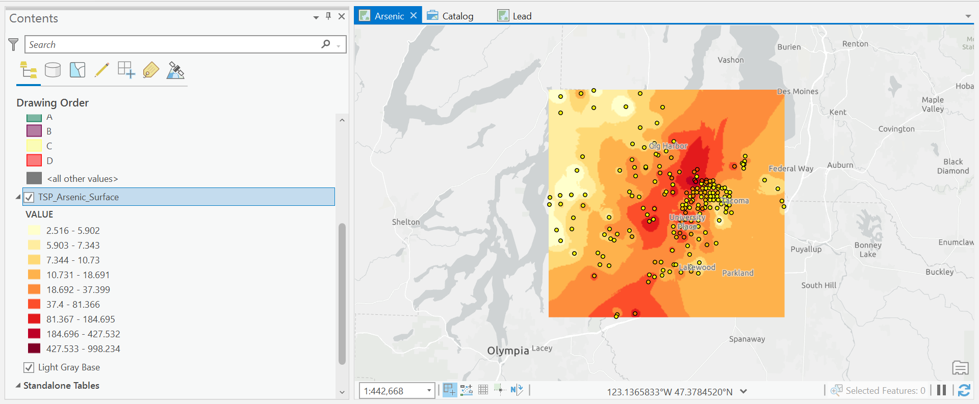
Run the Tool, and the result should be added to your map!
You guys create your first Raster!
Now, take a look and explore this data. How is it different the vector datasets we have worked with thus far?
Change the symbology to use a yellow-orange-red color gradient where yellow is areas of low arsenic and red is high levels of arsenic.
Repeat this process for Lead Contamination in your second map.
Include a screen shot of your IDW result for each of Arsenic and for Lead in your write-up.
So cool, we now know where contamination of Lead and Arsenic is. Now let’s actually compare our neighborhood data to these contamination levels.
We will use a tool called Zonal Statistics as Table to calculate the average Arsenic and Lead contamination per neighborhood.
Make sure to read the tool description!
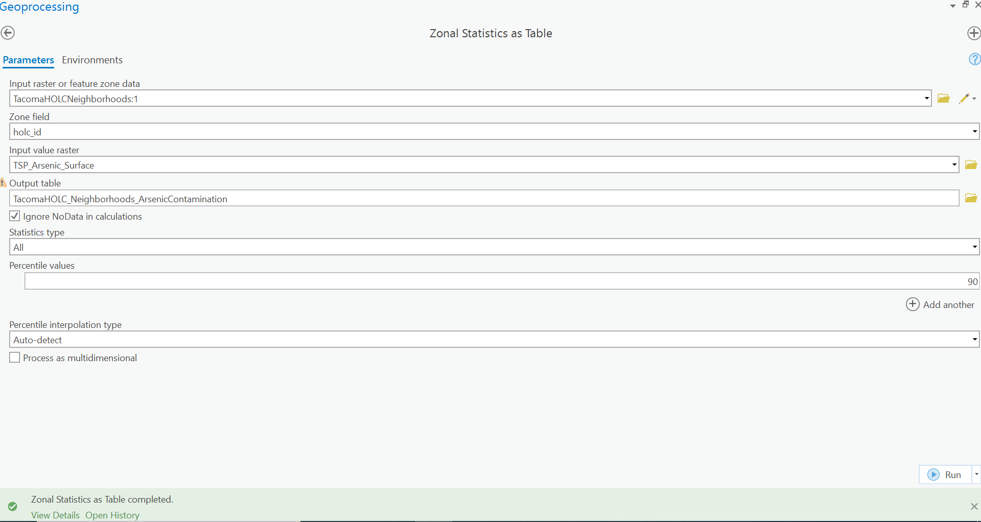
This output, is going to look at all the cells that are within a Neighborhood polygon, and calculate the statistics for each cell. So in one case, you can think back to our raster, cell size actually has quite an influence on values like this.
But to the results of our tool, this will result a table in our Geodatabase, where we can join it back to our Vector HOLC Neighborhoods to display our results.
Repeat this process for the lead contamination map
Display
For our maps, let’s re-create the maps using this data from the Pierce County Health Department Arsenic and Lead Soil Testing.
First, symbolize the Arsenic Map.
Let’s create the four bins manually.

So let’s use our previous basemap we created here.
We could go through all the work of symbolizing our data, but that’s a lot of redundant work. Rather ArcGIS has a file format which preserves the styling for a given layer and its underlying data called a LayerFile.
Let’s open our previous lab, and export our data as a LayerFile for use in our new project.
Make sure to save your current GIS project, and then reopen CensusGeographies Lab.
We are going to save our PierceCountyBasemap and PierceCountyRoads data as layerfiles.
Right click on the layer in the contents pane, and select Sharing. Click Save As Layer File.

This will save a .lyrx file, which we will navigate to our new TacomaSmelterPlume Map directory to save the data.
Add this data to your TacomaSmelterPlume Map and you should see your roads, with all the styling already completed. Do the same for the PierceCountyBasemap.
Nice a simple now, let’s just two basic choropleth maps representing the Arsenic and Lead contamination in our neighborhoods.
Think about this time what our layer names are, and how our numbers and bins are labelled for easy understanding.
Round our bins to the closest even number for each element. Add a title, and export the map.